
Choosing the right Color Schemes That Attract Tenants and Buyers in Multifamily Buildings is one of the most effective—and affordable—ways to increase property appeal. Whether you’re refreshing an older complex or designing a brand-new community, the right colors can dramatically influence how quickly units lease, how buyers perceive value, and how residents experience their homes.
In multifamily real estate, colors aren’t just decorative. They shape emotions, define ambiance, and set the tone for the entire living environment. With competition increasing across rental markets, using smart color strategies has become essential for property owners and developers.
Understanding the Power of Color Psychology in Multifamily Real Estate
Emotional Influence of Color
Colors influence mood, comfort, and perception. Tenants and buyers often make decisions within the first few seconds of entering a space, and color plays a major role.
-
Soft neutrals create calm and familiarity
-
Cool tones feel refreshing and modern
-
Earth tones connect people to nature and warmth
Why Color Matters for Leasing and Selling
Color can influence:
-
Lease speed
-
Sales price perceptions
-
Property branding consistency
-
Resident satisfaction
According to design experts, color mapping a building’s interior can improve overall tenant experience and enhance the sense of community.
Top Interior Color Schemes That Attract Tenants and Buyers
Soft Neutrals: Warm Whites, Beiges & Greiges
Soft neutrals are the top-performing color palettes in multifamily housing because they:
-
Make units appear clean and new
-
Help tenants visualize their own furniture
-
Appeal to the widest demographic
Ideal Use Cases for Neutral Palettes
-
Living rooms
-
Hallways and corridors
-
Common-area lounges
-
Bedrooms
Colors like Swiss Coffee, Pale Oak, and Alabaster continue to dominate tenant preferences.
Cool Tones: Blues, Greens & Soft Grays
Cool tones create a modern, calming atmosphere that appeals to younger renters and buyers.
Enhancing Space Perception and Calm
-
Light gray: Clean, upscale, spacious
-
Pale blue: Soft, airy, relaxing
-
Muted green: Fresh, organic, and restorative
These colors work especially well in coastal markets, urban new builds, and modern renovations.
Earth-Inspired Tones: Clay, Sage & Sand
Earth tones bring warmth and natural comfort to interiors.
Creating Warm, Invite-Ready Units
-
Sage green kitchens are trending for their timeless appeal
-
Clay tones are perfect for accent walls
-
Sand colors soften the architectural lines of small spaces
These shades reflect biophilic design principles, now widely adopted in multifamily communities.
Best Exterior Color Palettes for Multifamily Buildings
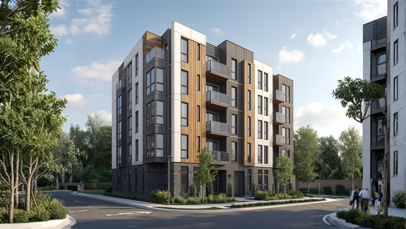
Modern Minimalist: Whites, Blacks & Charcoal
This look is dominating modern multifamily design.
-
Sharp contrast = high perceived value
-
Works well on new builds
-
Excellent for properties targeting young professionals
Urban Contemporary: Taupe, Slate & Matte Accents
Urban palettes feel refined and upscale.
-
Taupe reduces visual heaviness
-
Slate brings an elegant tone
-
Matte black trim adds dimension
Nature-Driven Exteriors: Forest Green, Brown & Stone
Great for suburban or wooded properties.
-
Blends beautifully with natural surroundings
-
Evokes stability and warmth
-
Timeless and easy to maintain
How Color Influences Perceived Value and Rent Prices
Colors That Make Units Look Larger
-
Light neutrals
-
Cool grays
-
Soft blues
These tones reflect more light and visually expand the room.
Colors That Elevate Luxury Appeal
-
Deep navy
-
Charcoal
-
Champagne beige
-
Matte black accents
Even subtle use of these colors can make a unit feel higher-end, increasing rent willingness by 5–10% in some markets.
Avoid These Color Mistakes in Multifamily Properties
Overly Bold or Trend-Driven Palettes
Trendy colors age fast. That bright teal accent wall? It’s fun today, outdated tomorrow.
Colors That Reduce Market Appeal
Avoid:
-
Bright reds
-
Vibrant yellows
-
Overdone dark colors
These can make spaces feel small or overstimulating.
Case Studies: Successful Multifamily Color Transformations
Class B Renovation Increased Rent by 12%
A tired Class B property in Phoenix adopted a greige-neutral interior palette with matte black fixtures—resulting in higher retention and rent growth.
Exterior Refresh Boosted Occupancy
A dated 1980s exterior repainted with charcoal, white, and warm wood accents saw rapid leasing and improved curb appeal.
Expert Tips for Choosing the Perfect Color Scheme
Considering Local Demographics
-
Young professionals prefer cool tones
-
Families lean toward warm neutrals
-
Seniors prefer soft earth tones
Lighting, Climate & Regional Trends
-
Warm climates → cooler palettes
-
Cold climates → warmer palettes
-
Sun-rich regions → deeper tones work well
FAQs About Color Schemes in Multifamily Buildings
1. What colors attract renters the most?
Soft neutrals and light grays consistently attract the widest renter base.
2. Do dark colors work in small apartments?
Only when used as accents; they can make spaces feel smaller.
3. Are trendy colors worth using?
Use trends sparingly to avoid rapid obsolescence.
4. What’s the best color for kitchens?
Sage, white, cream, and soft gray are top choices.
5. How often should owners repaint?
Every 3–5 years for interiors; 7–10 years for exteriors.
6. Do exterior colors affect property value?
Absolutely—modern palettes improve perceived quality and leasing speed.
Conclusion
Choosing smart Color Schemes That Attract Tenants and Buyers in Multifamily Buildings can significantly boost leasing speed, elevate market value, and improve resident satisfaction. Whether you manage a Class A luxury tower or a value-add community, color is one of the most cost-effective tools available to create meaningful impact.
For more on color psychology, you can explore reputable design insights at external resources such as Houzz or Architectural Digest.